Overview: Redesigned the Conagra Foodservice website to simplify product discovery, update design, and create a user-friendly experience tailored to foodservice professionals.
Jump to:
•
•
•
•
•
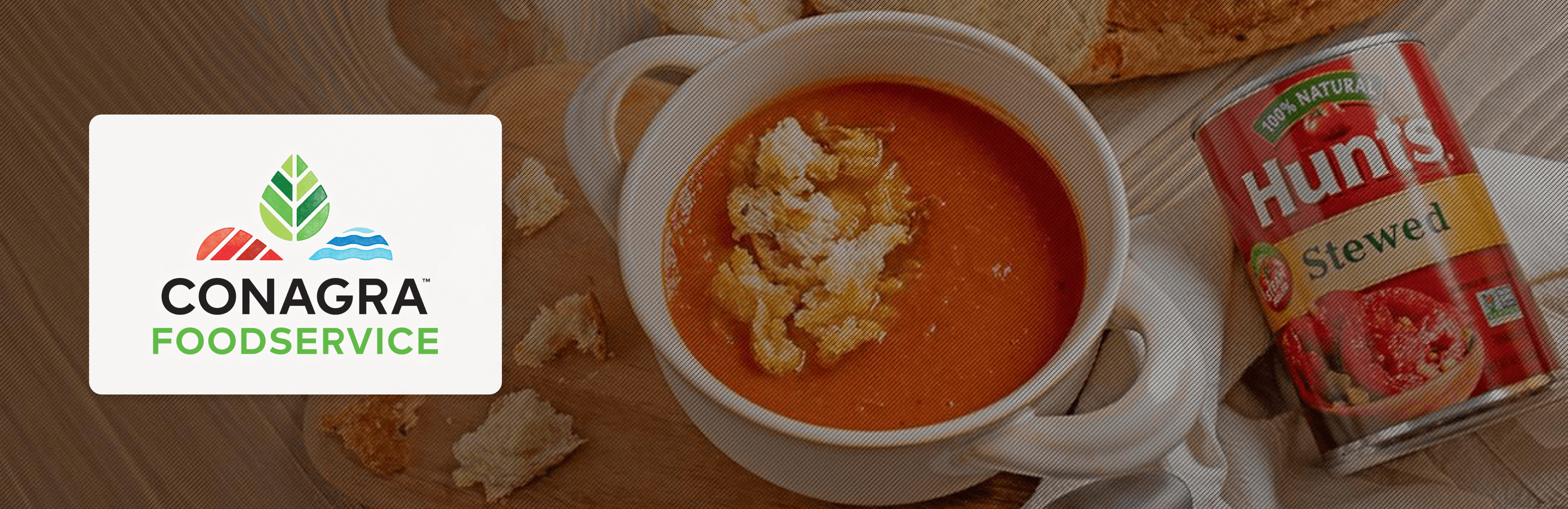
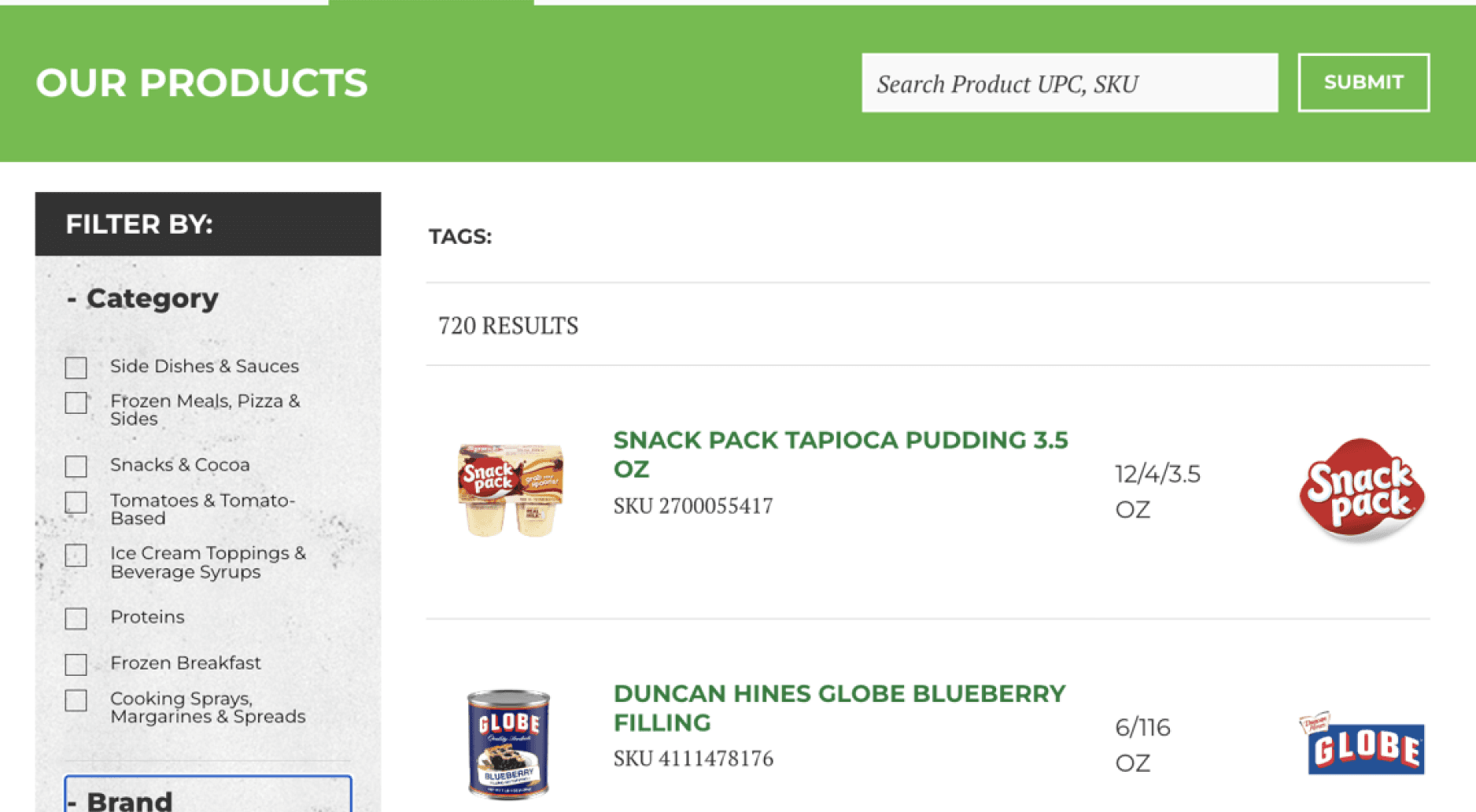
Challenge: Conagra's website was outdated and challenging to navigate, with limited sorting and filtering options for its extensive product library. Also, rudimentary product pages and a lack of intermediate-level category landing pages impeded e-commerce performance.
Objectives: To redesign the website, enhance usability, streamline navigation, improve product discoverability, modernize the visual aesthetic, and improve e-commerce.
My Role: UX Management, UX Research, UX Strategy, Interaction Design, Website Design, System Design, Figma Subject Matter Expert, Mentor
UX Research
In order to prepare for the redesign and gain additional category insights my team conducted a thorough audit, spoke to stakeholders, and performed competitive analysis to understand gaps and create benchmarks.
Heuristics Evaluation
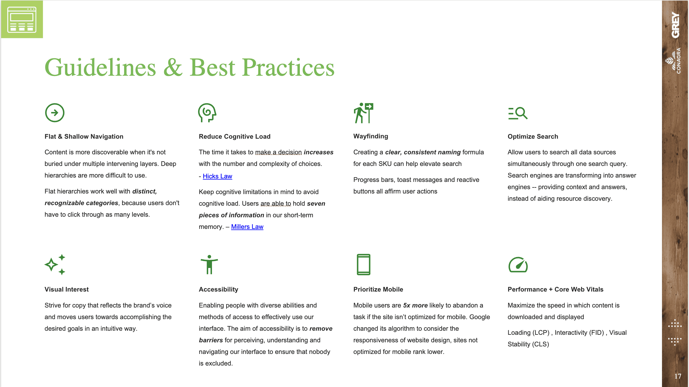
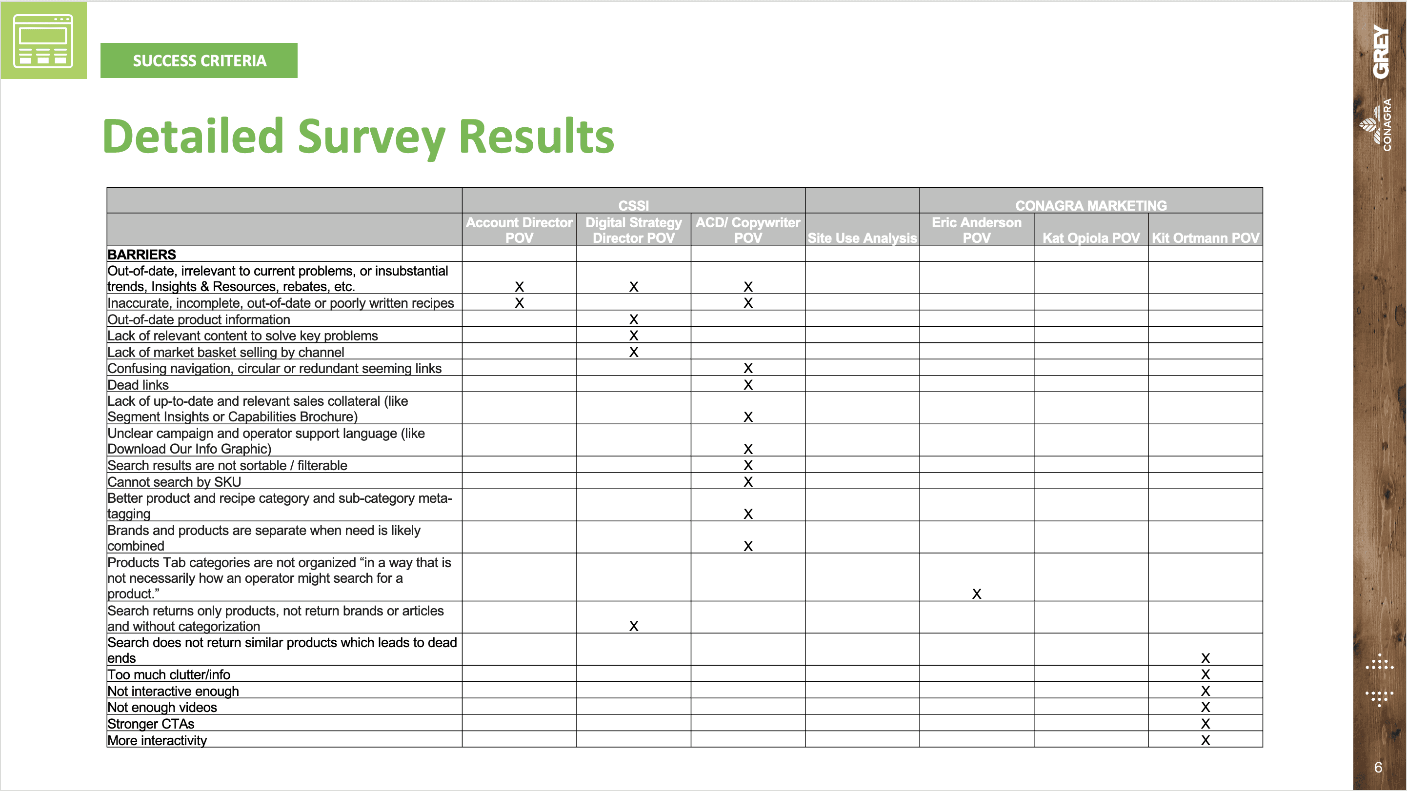
I partnered with brand strategy and design to create a heuristics evaluation that identified problem areas across the website. Key findings included:
•
Outdated Visual Design: The site’s design and content was out of date and did not align with modern web standards, diminishing user trust and engagement.
•
Confusing Site Architecture: Inconsistent menus and navigational dead-ends made the site frustrating to use.
•
Limited Filtering: Insufficient options for sorting and filtering made it difficult to discover relevant products.
•
No Category Pages: The lack of intermediate-level category pages hindered users’ ability to explore and understand product groupings.
•
Rudimentary Product Detail Pages: Product pages were inconsistent and often lacked essential information and features.
Stakeholder Survey
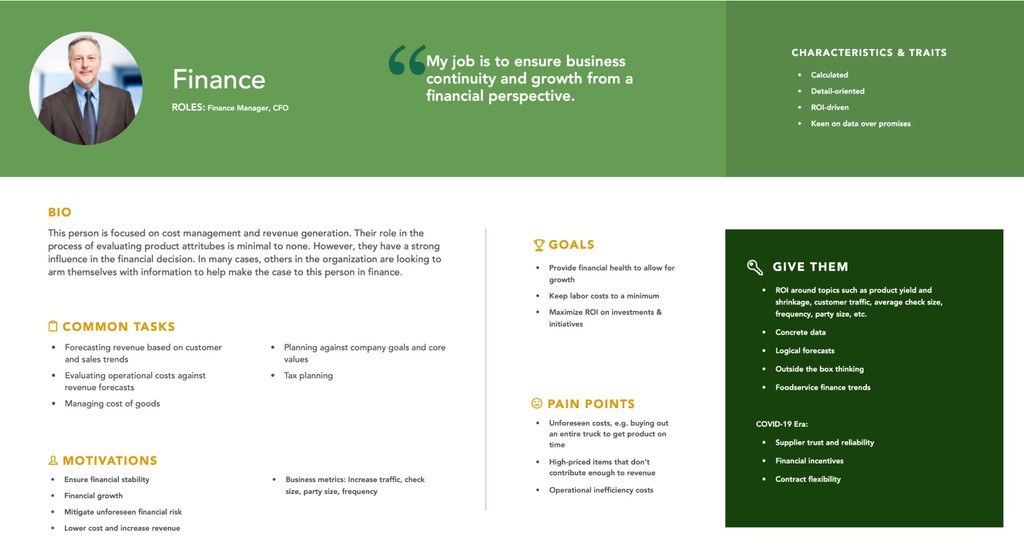
Then, we surveyed client stakeholders to determine business goals and identify key audiences. This provided valuable information that shaped the project’s priorities, scope, and objectives.
Competitive Research
We also performed competitor research to determine benchmarks and better understand the competitive landscape. We gained valuable insights into topics like which tools were standard in the industry, how websites were organized, how products were named and categorized, and what design patterns users would be familiar with.


UX Strategy
After completing the research phase, we formulated a plan to improve core areas of the website that would differentiate Conagra from its competitors and deliver a best-in-class user experience.
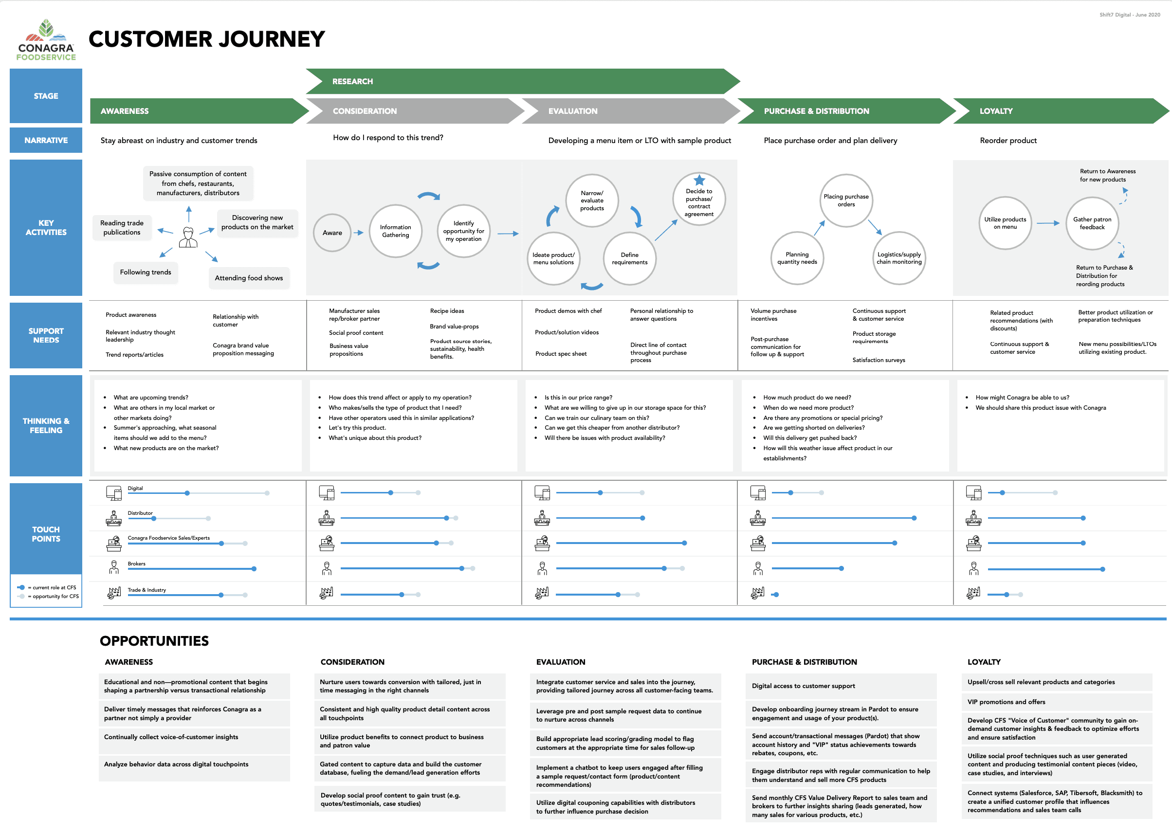
Customer Journey
Then we developed a customer journey map to better understand how users interact with Conagra at each stage of their decision-making process.
The map highlighted key touch points, bottlenecks, opportunity areas—such as post-purchase support, evaluating options, and enriching product discovery.
This ensured that the redesigned website would align with user needs and business goals, offering relevant solutions at every stage.
Features & Functions Planning
Based on all the research we completed, we then proposed a feature set that could meet both user and stakeholder goals:
•
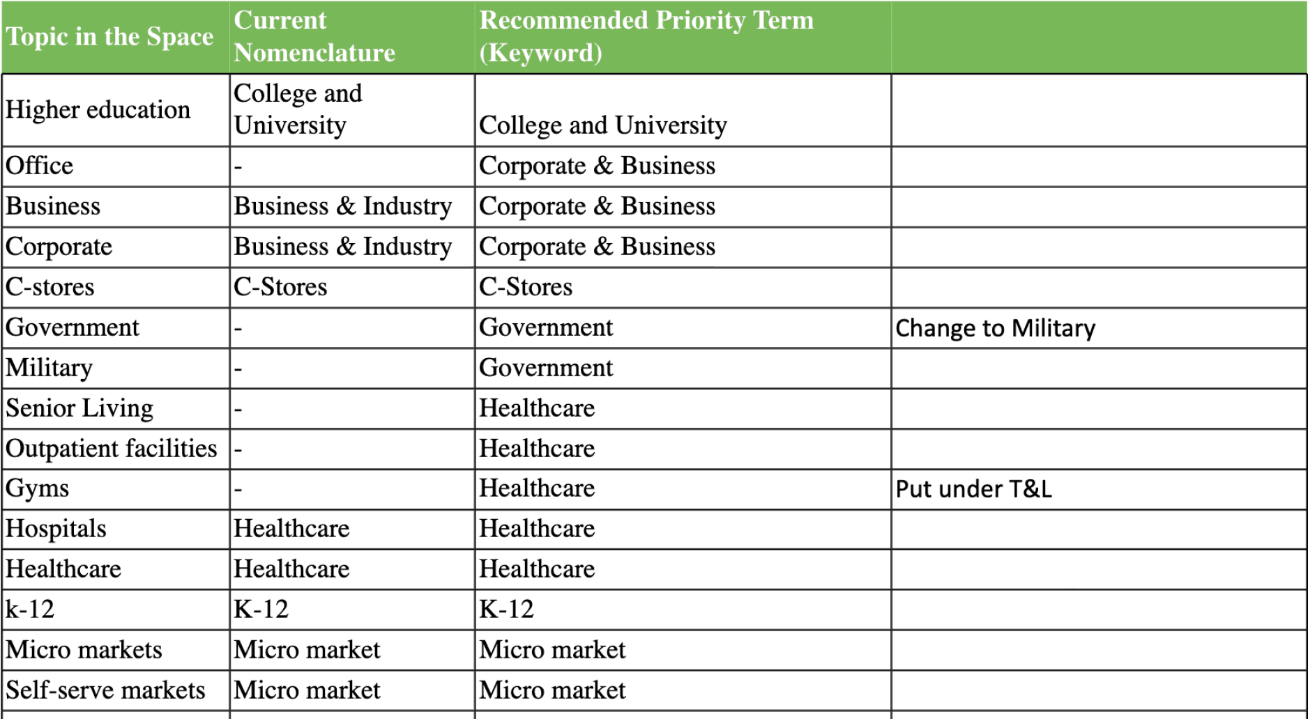
Improved Taxonomy: We prioritized overhauling the categorization and nomenclature of the product library, which would enrich search, enable functionality like advanced filtering, and allow for the creation of new category landing pages.
•
Streamlined Navigation: Redesigning the navigation to improve usability and visual appeal would ensure users could find information effortlessly and allow the client to guide users effectively to new or featured content.
•
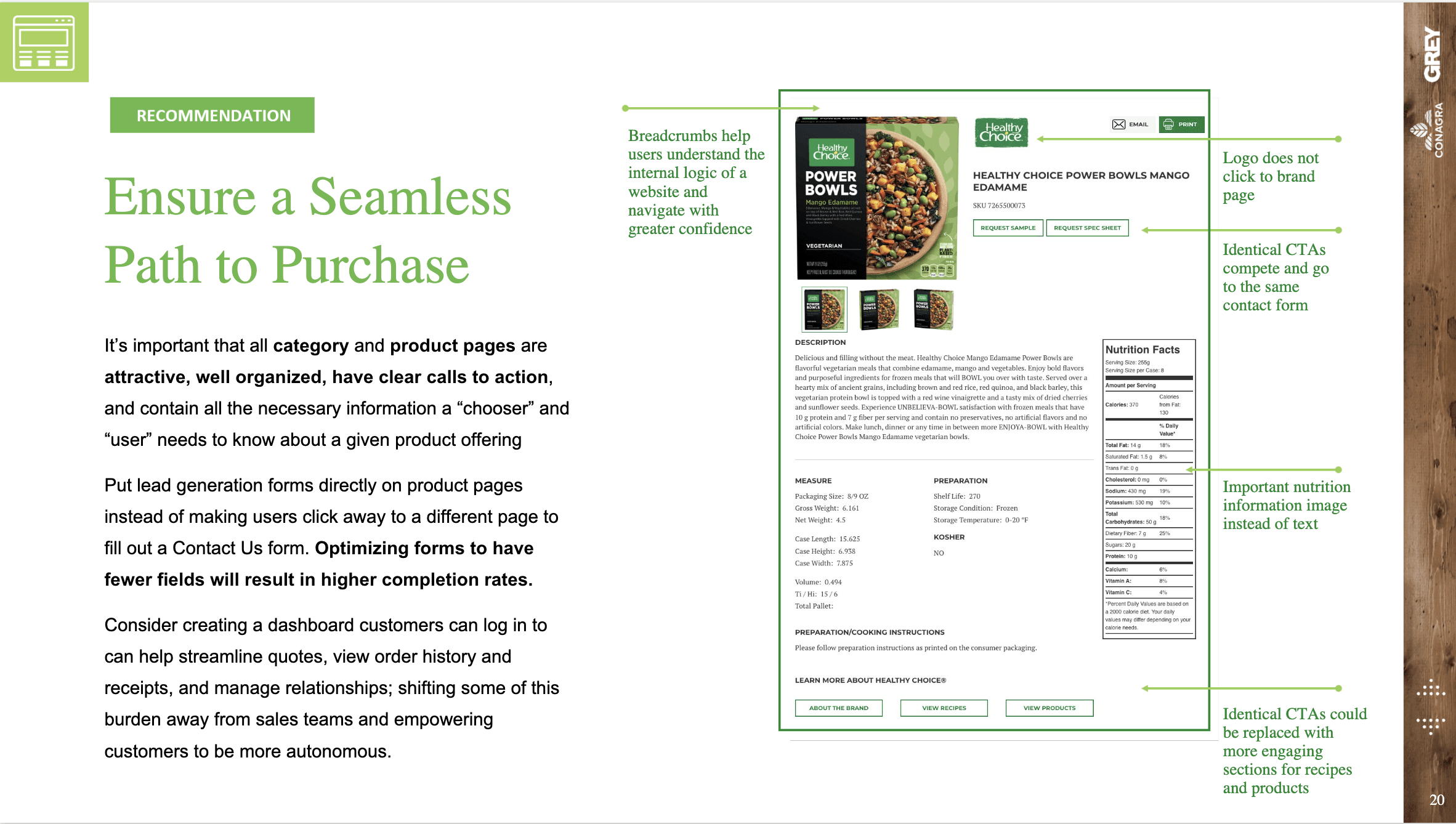
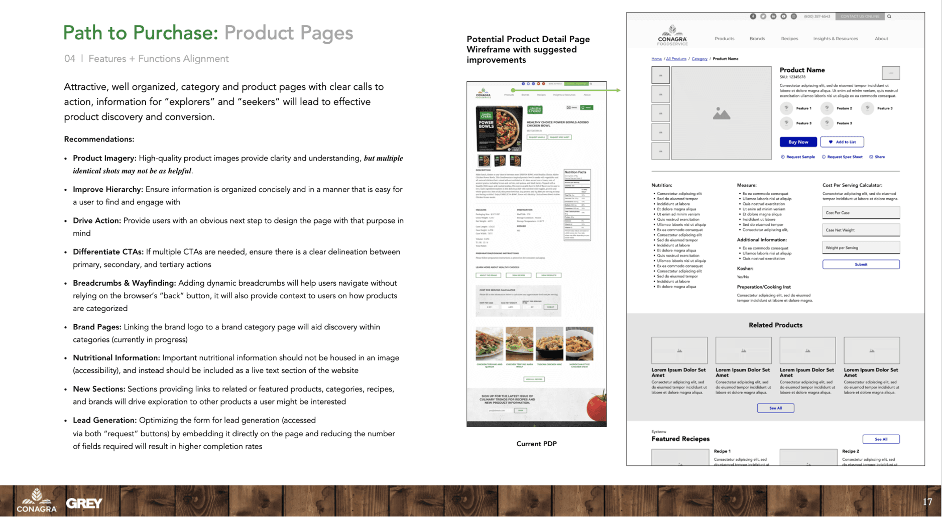
Enhanced Product Pages: Revamping product pages with detailed spec sheets, calculators, and more focused calls to action would better support users making decisions.
•
Industry-Specific Categories: Creating new categories and pages for specific industries created better pathways for users to explore the product catalog.
Interaction & UI Design
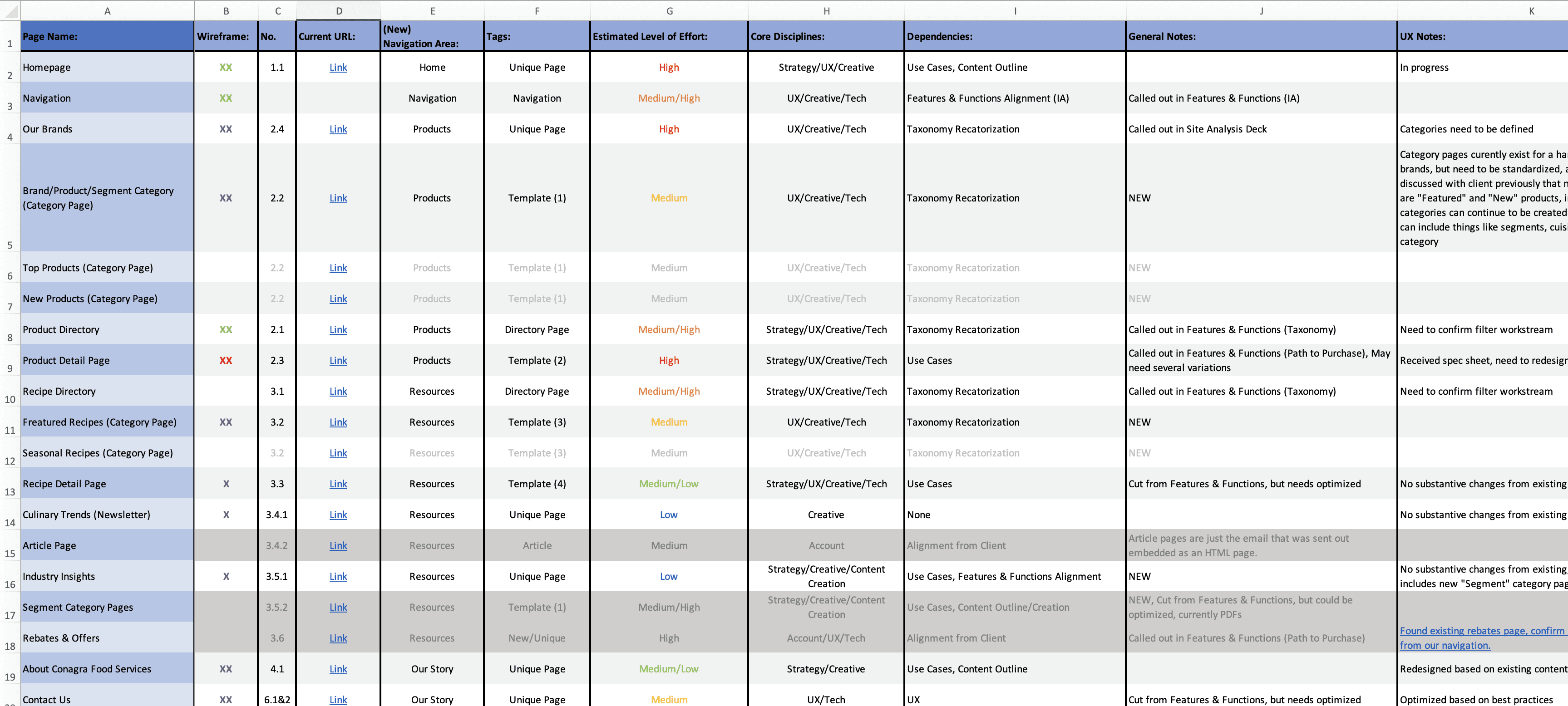
Once we aligned on the feature set with the client, we set about bringing the website to life, proposing updates to the taxonomy, creating sitemaps, wireframes, and a component library the designer's could use to build the website.
Information Architecture & Taxonomy
Using insights derived from search, we proposed updates to nomenclature, categorization, and tagging to make the product database more robust. This provided a stronger bedrock for the entire site, improving navigation, on-site and off-site search, and enabling the creation of effective category and industry-specific landing pages.
Sitemap
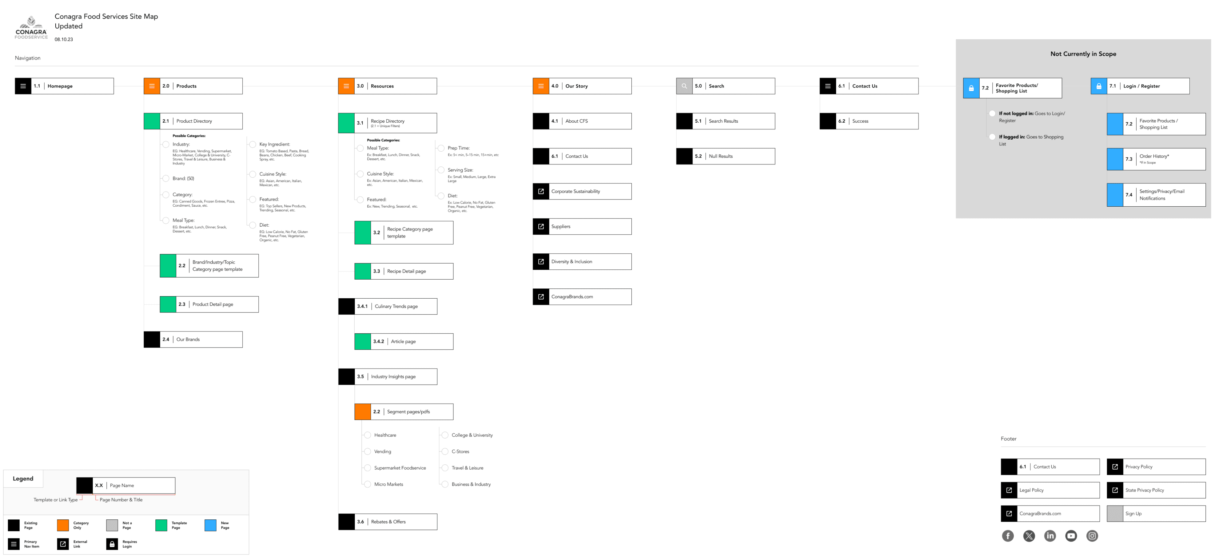
Once the taxonomy work was complete, I created an updated sitemap to guide the process and organize the site. The structure included new landing pages for industries and meal times and eliminated several redundant pages that were no longer being supported by the client.
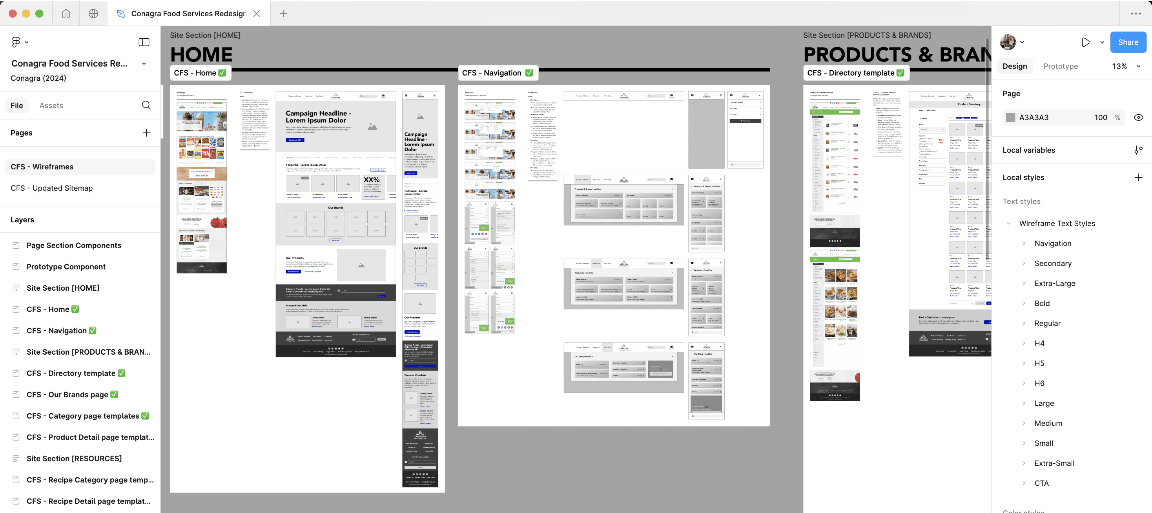
Wireframes, Design System, & Component Library
Figma Training
Before moving into the full design phase, I identified a gap in our team’s Figma proficiency, which would have hindered collaboration and efficiency. So, I took the initiative to create training materials and lead sessions to ensure all team members had the skills needed to use Figma effectively.


Lunch & Learn Sessions
I led several agency-wide Lunch & Learn trainings to introduce Figma’s core features and benefits. These sessions were designed to introduce best practices and encourage team-wide adoption of the tool.
1:1 Mentorship
In addition to leading group trainings, I provided personalized 1:1 mentoring for designers and creative directors across multiple teams and offices, answering questions and addressing their needs as they transitioned to using Figma more regularly.
Grey University
In September 2024, I was asked to lead another training session for the entire Grey network, which was recorded and posted to Grey University, an online employee training portal.
Results
Key Takeaways:
Taxonomy is the Backbone of Product Heavy Websites
Revamping the websites taxonomy introduced clearer categories, that enabled novel ways for users to navigate the website. This also improved the ability to search, sort and filter a product library and made it easier for users to find information about products they were interested in purchasing.
Training Creates Efficiency and Promotes Collaboration
Investing time training teams to use a new tool enhanced collaboration and saved time and resources. By leveraging wireframes built with a generic design system and component library, designers were able to quickly and efficiently design a large website. This approach enabled rapid project delivery and ensured smoother transitions between the UX, Creative, and Development project phases.
Additional Credits
Agency - Grey
UX/CX Director - Emmanuel Bakarema
Senior UX Consultant - Ruzanna Rozman
Strategy Director - Nathan Zwilling
Associate Director of Search - Rebecca Wynne
Senior Data Strategist - Janine Brandt
Creative Director - Nicole Rauer
Art Director - Mitch Beckman
Art Director - Erik Bork
Senior Copywriter - Darby Byrd
Associate Director of Technology - Jason Bachman
Account Supervisor - Aiden Roberts-William
Group Project Director - Nick Palermo